Morefield Communications prides itself on being a nimble, local company that delivers their customers speedy support and quick turn-around times. While looking for ways to introduce their services to key prospects in the healthcare industry, the team decided to go dimensional with their marketing efforts.
Briana Carr, Morefield Communications’ marketing manager, said she was looking for a piece with shelf life; one that could sit on recipients’ desks to keep her company top-of-mind.
Impressed by Red Paper Plane’s unique products after receiving a recommendation from a business partner, Carr reached out and began designing a piece with a freelance graphic designer.
“We were targeting the healthcare industry in a few select areas to make them aware of some healthcare technology solutions we provide and introduce a new manufacturing partner’s solution,” she said. “I had watched the video on your site to get a feel for this piece and, in the end, I really was there to let them know that we’re the local partner that they should go to.”
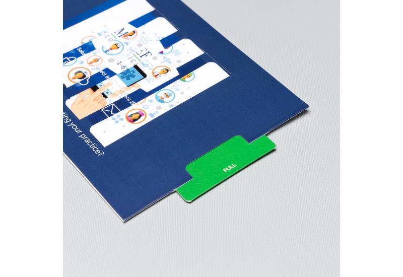
The piece was one of Red Paper Plane’s newest designs: the Magic Changing Picture.
What’s so unique about this format is that it allows businesses to showcase two sides of their story. When you pull the tab, the panels in the die-cut window transform to showcase something entirely different, whether that’s a cause and effect, a before and after, or multiple parts of your brand messaging.
According to Carr, the piece was a perfect fit.
“There was a picture showing the technology and when you pulled the slide, it was our logo with our information,” she said. “That’s really what we wanted them to remember.”
With a bit of help from the Red Paper Plane customer service team, Carr was able to upload her customized design and order 300 copies just in time for the launch of the campaign.
When asked how the piece turned out, she said she really liked it.
“It looks good. It very much looks like what I worked out with the graphic artist,” she said. “The quality of the project, it had a very nice weight to it. It’s not your normal flimsy flyer that you would toss. So, right away it kind of catches your attention, like, ‘Oh, what is this?’ when you’re opening the piece."
“It was kind of the reaction that I was looking for. It catches the person’s attention while getting the brand in front of them.”